Simplify Your Interface
I've noticed recently that a lot of interfaces are adding a lot of interesting effects, animations and view behaviour. A lot of times these views simulate three dimensions. Some views move under other views and others stay on top. The issue is that these views are displayed in only two dimensions on a bitmap display (and probably will continue to be for the near future). Based on the way these views behave, the user has to put together a model of how these views relate to each other. Simulating lighting with shines and drop shadows can greatly help a user to put together a three dimensional model when only given two dimensions of information. This is just a reminder that the number of layers should be kept to a minimum to prevent a confusing model. Try building (or imagine) your interface with real world materials. Can it be done easily? If not, consider rethinking your app. It's much easier for your users to understand the behaviour of your app if it can be built using materials we use daily in the real world.
Let's take an app I've been thinking about a lot recently as an example: Rdio's iPhone app.
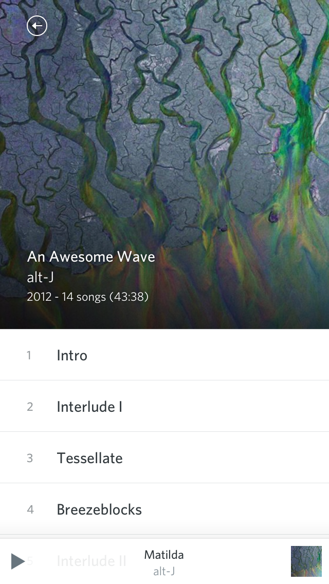
In the album view, it displays an arrow on the top left that appears to be on top of the album artwork. Towards the bottom of the square album artwork, information about the album is displayed. Below the album artwork is a list of the songs which is slightly cut off by the bottom of the screen. This hints that this view expands beyond the bounds of the screen and could be interacted with to reveal other content (a scrollview). Stuck to the very bottom of the view, a transparent box is displayed with information on the currently playing song. Before interacting with the interface, the user will likely assume that there are just a few main layers in this interface. One layer is a scrollview with the album artwork and track list. These elements are not currently overlapping and share similar information (in comparison to the rest of this screen, and especially compared to the rest of the app). Another layer, above the previously mentioned layer, contains navigation elements (the back button and the now playing information). Previously, I mentioned that the track list information appeared cut off, which hints that the size of this view might be larger than what is currently visible. The device itself is preventing the whole thing from being displayed at once and the screen is simply a window into a layer below the face of the device. This diagram from the manual from the 1984 Macintosh depicts how a scrollview works. Although it is obvious to most people that use a computer regularly, it's still very important to think about these things when designing interfaces.

Based on some previous experience with iOS and/or a three dimensional model of this view and understanding of physics, a user may place their finger on the view and slide it up on the screen. Just a moment after this, something amazing happens. The list of songs not only follows the user's finger, but it slides right over the album artwork! I bet you weren't expecting that!
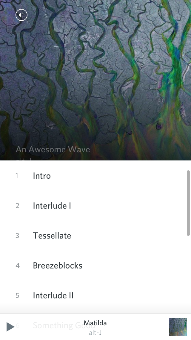
Now the user's mental model of the app is broken. After all that excitement, the user and the interface both calm down.
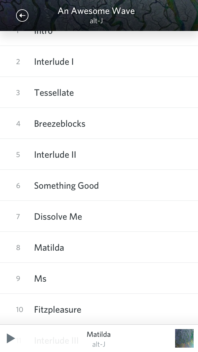
The user now re-examines the app to see create a new mental model that works. The user still sees the arrow, but now with information on the album next to it. Hmm... this information must have moved to the top when we moved that list of songs to the top. The user still sees a similar looking list of songs with more content and still sees the now playing information stuck to the bottom. Let's adjust our model. There's actually even more layers than we previously imagined. It appears that the album artwork is below the track listing and the track listing window (that's essentially what a scrollview is) expands at the same time as the user scrolls. That's pretty complicated stuff! Also, when scrolling far enough, the track listing scrollview frame stop about 40px away from the top of the screen and disappears. It almost looks as if someone made a dark hole in the middle of the album artwork that the scrollview flys into. Or the album artwork is actually two layers that due to the user's limited two dimensional perspective appear to be on the same layer. Doing eye tricks like this is *not* good! Imagine trying to recreate this view using paper.
Hey! But, Matt! Don't give unsolicited critique like that. I also encourage anyone to critique my work and offer suggestions. It will help me improve my work and learn from other's experiences. Well, I won't keep you hanging. I'll offer a suggestions on how to fix this issue and create a much simpler behaving view. Instead of having the album artwork and track listings on two separate layers, have them in the same scrollview. When the track listing scrolls, the album artwork should scroll with it. The bottom of the album artwork should be attached to the top of the track listing. When scrolling far enough, the light colored back arrow, which is a design nightmare in it's own (detailed in my previous post), will be difficult to see against the light background of the track listing. A solid (translucent *may* work as well) bar containing the navigation interface elements will help create enough contrast to see these elements. Constructing this interface with real world materials is a much simpler task than before.
Don't sacrifice cognitive simplicity for fancy animations and interface element behaviour. There is probably a much simpler way of doing this with the same information and still have some fun, delighting animations and interface behaviour.
Note: I still haven't even talked about the animation of the views that brought us to this view in the first place (that may be a post for another day). Spoiler: it may be even more complicated!
This app does not have a lot of strong shadows, highlights, or textures. Most people would say it's very "simple". However, this app has one of the most complicated navigation and view behaviours in any app I've ever used.
stylistic simplicity != visual simplicity != actual simplicity