Designing an iOS App with Proper Navigation (Part 1)
I started this back in February but never got around to finish it. Here's part 1:
Navigation is super important when designing a mobile app. Apple makes this pretty easy by providing great tools to do this, however, I still see many apps that don't follow iOS navigation conventions and it results in an almost unusable app. I'm going to talk about what the conventions are, and why they're used so you'll be ready to start designing better apps.
There are two main controls that deal with app navigation iOS.

UINavigationBar backed by UINavigationController
This control sits just below the status bar, at the very top of your app.

UITabBar backed by UITabBarController
This control sits at the very bottom of your app, above the home button.
The navigation bar shows the title of the currently displayed view (centered). It may also contain a button on the right to do certain tasks with the content below. Some common buttons displayed here are add, edit, compose, and action. The left of the navigation bar may have a back button to the previous view in the stack, if any. The back button should always have the title of the previous view controller and never the word "back". Doing this tells the user that they're navigating back, and where exactly they're navigating back to.
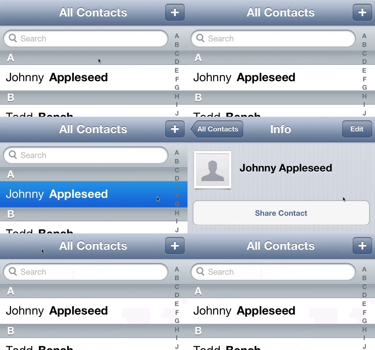
For example, viewing a contact in Contacts.app will show the contact's group in the back button. The animation is also very important. The title transforms into the label on the back button as it moves left.

A common trend is to remove the label and replace it with just an arrow for the sake of minimalism. Let's take a recent offender of this, the official Twitter app:

The old Twitter app, (left) and the new app (right) featuring the new back button.
This is an awful idea as it now removes all context of the current view. How did you get to the current view? Some say "Well, you just navigated to that view! Of course you know where you are." That's not true as soon as you move to another app (or lock your device), and return to the app at a later time.
@flyosity in some cases it's useful as a way to know what you're looking at. <Inbox | Message vs. <Trash | Message
— Loren Brichter (@lorenb) February 6, 2013
It is not always the case that you directly navigated to that view, and therefore it is even more important to know where you are and where the back button is taking you. Tap on a notification and you could be put a couple levels deep in an app.
Since people who design and build these app are likely to use their devices for many hours a day, and become extremely familiar with every view in all their apps, it is easy to forget about designing for those who may be new to (or less familiar with) the platform, or the app. The only thing that's changing when removing the back button label is clearing the screen of 1-2 words that hinders unfamiliar users and provides no additional benefits for power users.
Some apps will also require a tab bar, like Music.app. The tab bar allows you to separate out parts of your app. These items should change the current view and should be treated as their own. The only way to navigate between these views should be through the view controller (not the navigation bar). If the navigation bar behaves like a tree, the tab bar should simply be a collection of trees. Tapping on the tab bar item will bring you over to to the new tree. Tapping on a back button on the navigation bar should only move back in the tree but never to another tree!